CO skier
TUG Member
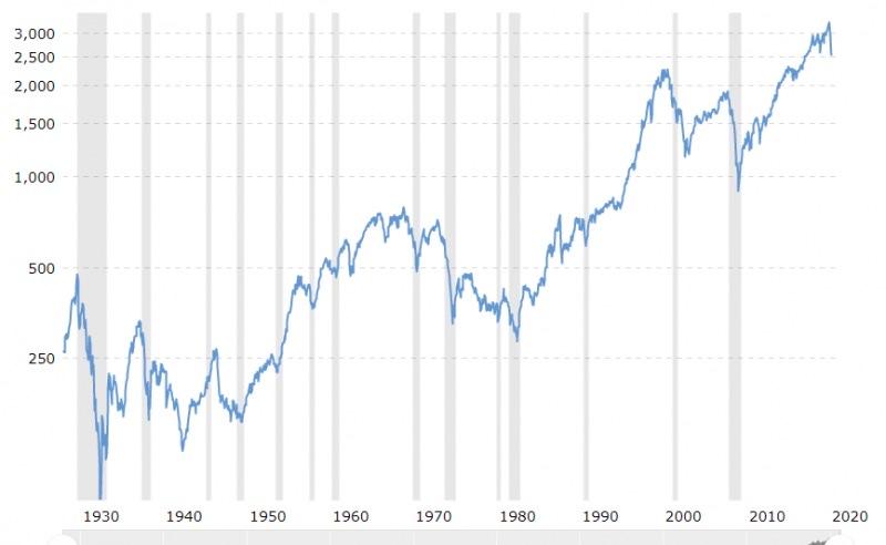
There are a few running stock market threads. None of them mention a long term perspective, so here is a 20-year, long term chart 1999-present covering three Fed-induced bubbles and one idea:
The chart shows the dotcom bubble of 2000 and the housing bubble of 2008 -- and the super-duper bubble we are in now. Really, just look at the chart and use common sense!
This is not investment advice, but from one Tugger to another, anyone close to retirement or in retirement should look at this chart and consider how much they want to have invested in the current stock market (super-duper bubble) environment and the ramifications if the selloff reaches the 50% level. (The top of long term support on the chart is 1500 -- more than a 50% decline from the 2020 market top. If this market bubble bottoms where the other bubbles did that would be in the range of S&P 500 at 700. Sure, everyone laughed at S&P 700 in 2000 and 2007, but it happened.)
Sell now to protect your retirement and reinvest at much lower levels. ymmv

")